
Are you redoing your daughter’s room and really struggling with the wall color? Does she want something bright and colorful but you don’t want it glowing into the hallway?
As a mom and a designer, I have been there too! You want to give her the space to let her vision blossom but you want her to have a room that she really loves to come home to.
Maybe you are thinking, “Paint is cheap, I’ll just let her pick it and we will paint it something better when she’s older.”
The only effective way to design a room is to plan. Designing IS planning, with intention and style.
When you want to create a room with a strong color influence, you want to choose a wall color that illuminates that color. For the sake of description, your daughter has decided that she wants a purple room. Seldom is the painting the walls that color the right choice. It limits the things that you can bring in. A strong wall color can get lost as furniture, art/posters, toys, awards, and bedding get added. But that doesn't mean that you can't create an AMAZING purple room. Placed strategically around the room, a great color can have impact AND create a cohesive design!
But it's the biggest mistake that parents and kids alike make.
Here are the 5 reasons why:
1. The Room is not large. More corners = More shadows
Everywhere that the light can’t reach directly is going to appear darker. The smaller the room the closer the corners are together, the more furniture covers the wall space, and the less wall there is for light to hit it directly.
2. The main color becomes the background.
That super awesome color that she wants to use to express her personality or style becomes the background, not the star. And because contrast is what makes things pop, everything that you buy to re-emphasize that design statement is essentially camouflaged against the wall
3. It doesn’t have the "feel" she envisioned.
If you pulled the color from a comforter set or a fabric, that color will no longer be the principal color that you see. The colors that jump out at you are the colors that AREN’T the wall color. Again, the “Urban Camouflage” effect.
4. Keeping the room neat becomes a major headache.
The sole function of our brains is to keep us alive and safe from harm. Our nervous system is hardwired to detect contrast and disorder as mechanisms for our protection. It’s like shining a spotlight on the things that are out of place.
5. Color makes the biggest impact when it is the focal point.
You want the"feature color" of the space to be in the foreground. My best analogy: A play with a fantastic backdrop and really crappy actors is only ever going to be a crappy play.
“Think of wall color as the stage lighting that draws attention to the room.”
When you make the mistake of doing it the other way around, you lose the impact of the color and what it represents.
Here is a quick lesson on the roles colors play in design:
If you take a look at a color wheel and draw a line straight through the center on any axis and pick 2 colors that are equidistant from each side, they are called complements. When paired together, they emphasize each other. When mixed together, they cancel each other out. They become a muddy gray. It is what makes a NEUTRAL COLOR. Since some pigments are stronger than others, you can sometimes detect a bit of one of the original colors over the other. That is what is referred to as an UNDERTONE.
To maximize the “stage light effect” that a wall color can have on a feature room color is a
Master technique of a talented designer.
And it involves neutrals and undertones.
To make life easier and prevent you from making the very common mistake of choosing a wall color that doesn’t have the desired outcome on the overall room design; I have created
The Ultimate Cheat Sheet!
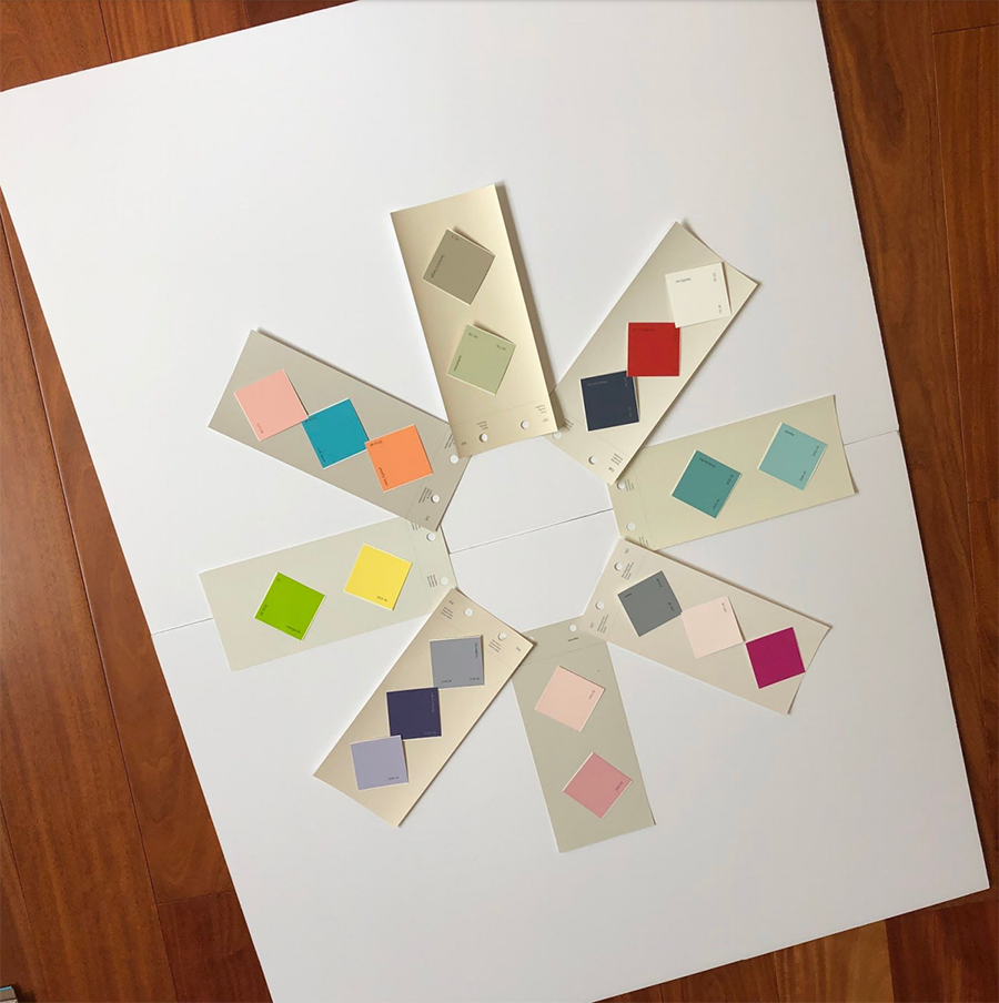
I have very carefully paired the most desired room color aspirations with the paint color for the wall that most effectively elevates that color and creates the desired design result.
There are 8 paint colors. All of my paint colors are Benjamin Moore colors. I have long believed that their colorant systems lead the industry. Their colors are purer and cleaner. And they were taking the bad stuff (the VOC's- the volatile organic compounds) out of their paints long before anyone else. It is the only paint the I would ever use in a room that a non-adult was sleeping in.
If you are looking to reproduce one of the many Pinterest-inspired white rooms with super pale walls then Classic Gray 1548 is your best friend. But if color is what you are after, click on my Ultimate Cheat Sheet above and you are on your way to success!
Happy painting!!
XO,
Lynne
* Designing a room that truly supports your daughter; that looks and functions as unique as she is, can be a beautiful journey. By creating a design plan that grows with your daughter can save you so much money in the long run. The healthy habits built into a great design plan will serve her as she grows into her amazing self!
Comments